Joshudavid
New member
- Mar 16, 2007
- 11
- 0
Does anyone know of a good resource or have any good ideas/pictures of creative design for drive thru buildings? I just bought an existing building and I'm switching it to way better coffee and upgrading the equipment. Nearly every drive thru around here has bad coffee.
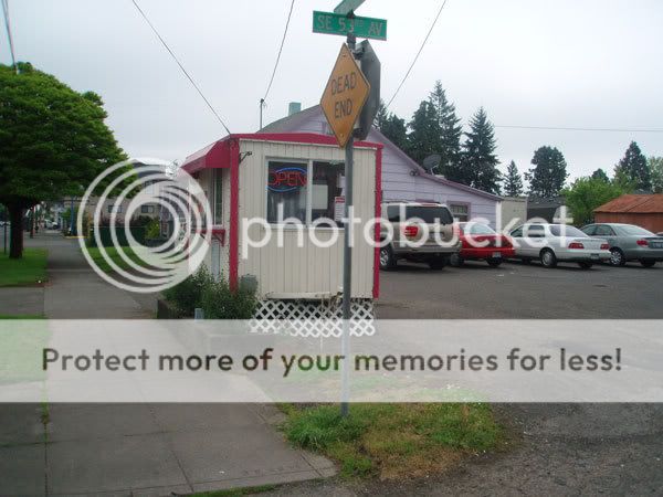
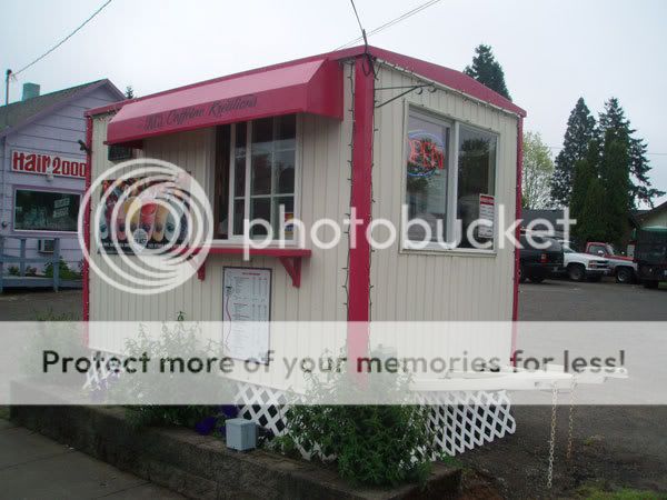
I want my shop to have the appearance of higher quality to people driving by. Here are some photos of what it looks like now.


I want my shop to have the appearance of higher quality to people driving by. Here are some photos of what it looks like now.

